MENYA KANKI
A Sea-to-Table Story
Located in the the Water Zone of ELEMENTS Mall, Hong Kong, Menya Kanki (麵家金鰭) is a Japanese gastronomic concept developed by F&B veteran - Marimo Restaurant Group. Inspired by the legacy of traditional Japanese Ama divers, renowned for their profound connection to the sea, Menya Kanki is dedicated to bringing the exquisite essence of fresh ocean flavours to Hong Kong through their signature seafood-based ramen. From its use of premium sea ingredients to its meticulously crafted artisan inspired collaterals and interior, the brand presents a captivating Sea-to-Table dining ritual that intrigues all senses.
House of Forme worked with Menya Kanki on their brand concept, identity design, collaterals development, brand environments and interior design of their first store in Hong Kong.
Inspiring Origins and Enduring Heritage
The concept design for Menya Kanki draws inspiration from the profound connection between Ama Divers and the ocean. Just as the divers determinedly honed their craft to gather fresh sea ingredients throughout history, our concept aims to exemplify the brand's steadfast commitment to perpetuating this tradition of presenting genuine sea flavours within a modern dining setting, all while revering to the brand’s Japanese craftsmanship heritage.
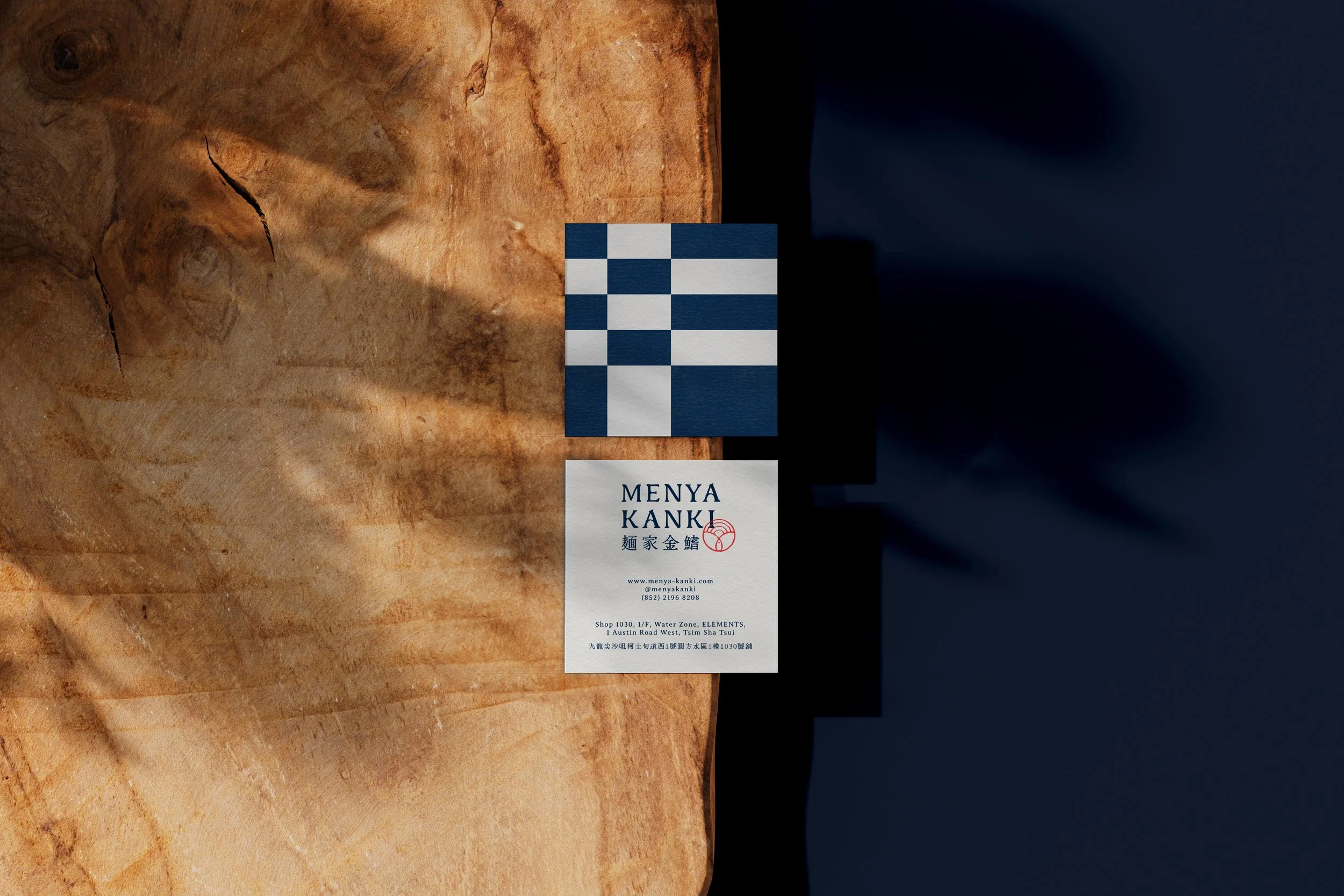
Our logo icon takes the form of a custom-made Kamon Crest, a symbol historically employed to express Japanese familial lineage using intricate floral and grass motifs. By artfully intertwining the symbolism of the sun, sea, fresh catches, ramen, and goggles with fluid curves, our conceptual Kamon encapsulates the core elements of Menya Kanki in their purest form, eloquently conveying a narrative that begins at the sea and culminates at the table. This logo emblem not only represents the brand's narrative but also embodies the enduring heritage akin to a red ink seal stamp.
In a parallel vein, our logotype concept finds inspiration in the classic art of traditional Japanese calligraphy. The English and Kanji typography is executed with organic curves and brush stroke textures, with each unique twist and stroke resonating with the authenticity and distinct character of Menya Kanki.
Modest. Authentic. Meticulous
Inspired by the serene depths of the ocean and the traditional art of Aizome indigo dyeing, oceanic blue was chosen as the brand's primary colour. Complemented by neutral tones including white, sandy beige, ink black, and seal red, which are derived from the hues of calligraphy utensils. This thoughtfully curated colour scheme symbolises the harmonious balance between nature and culture. In parallel, the brand's secondary graphics are an extensive portrayal of the brand's narrative, presented as geometric silhouettes reminiscent of patterns found in traditional Japanese attire. We crafted a visually impactful graphic system, by intertwining the modest yet contrasting colour palette with symbolic secondary graphic patterns. These designs have been meticulously integrated into all brand collaterals, including chopstick sleeves, napkins, and wet wipes packaging.
To echo with the culturally inspired design narrative, traditional fabric and material finishings was also incorporated into different brand touch points, evident in custom indigo denim coasters, denim uniforms inspired by Jinbei attire, and Maekake-style linen aprons. Adding an elevated touch to the overall brand experience.
A Continuing Story.
To model the brand's narrative into a physical store, the interior space was thoughtfully crafted to capture the spirit of Ama divers and traditional Japanese artistry in a contemporary manner. Continuing the 'From-Sea-to-Table' story, subtle allusions to the Ama's tools, such as timber goggles, buckets, and uniforms, were meticulously integrated into the space.
The store facade is divided diagonally, with the first part adorned with a striking feature wall consisting of 15 rounded metal domes resembling the silhouettes of Ama goggles and timber buckets. Constructed by khaki bronze metal, tinted antique mirror, textured glass, embellished with a brass logo and built-in lighting, this component stands out as a dramatic contrast to the tranquil and modest store interior, inviting visitors into a ritualistic journey of exploration.
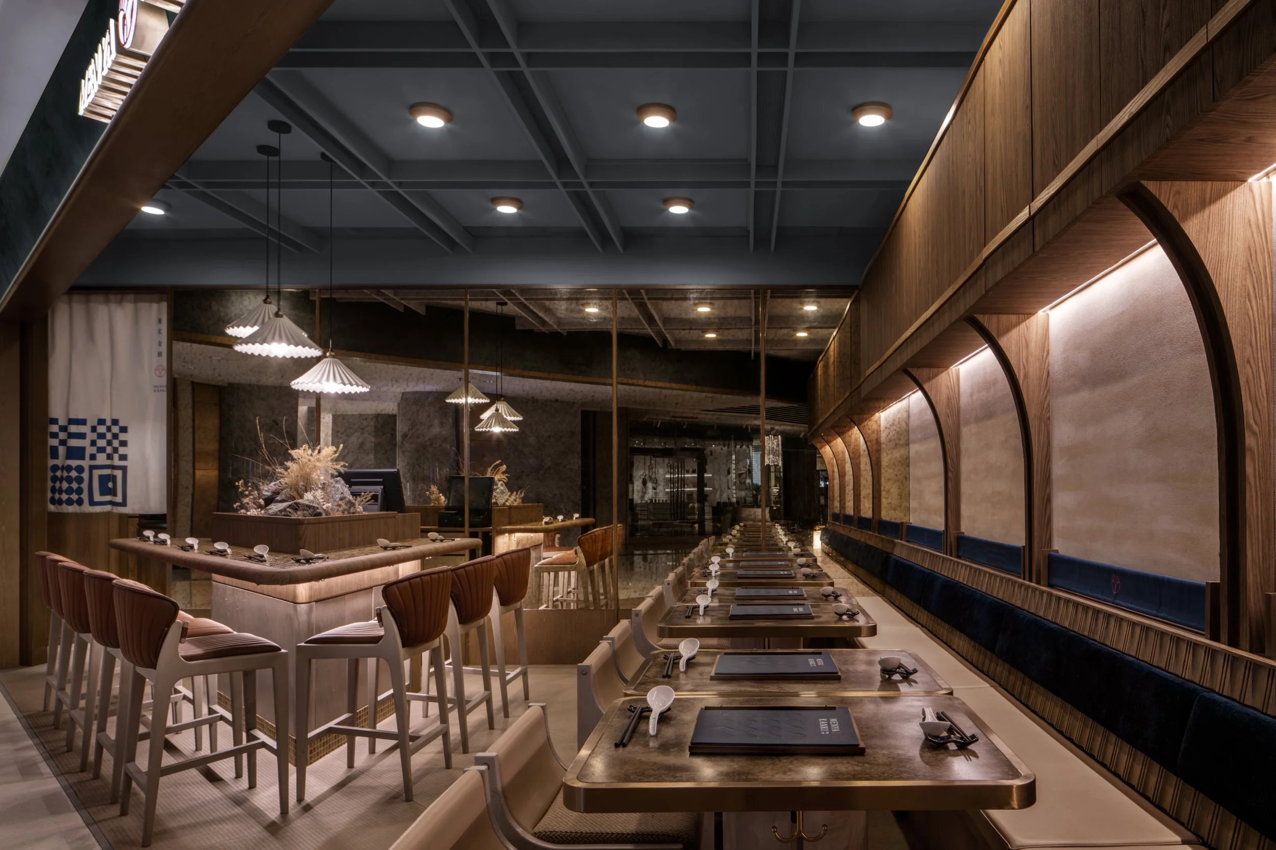
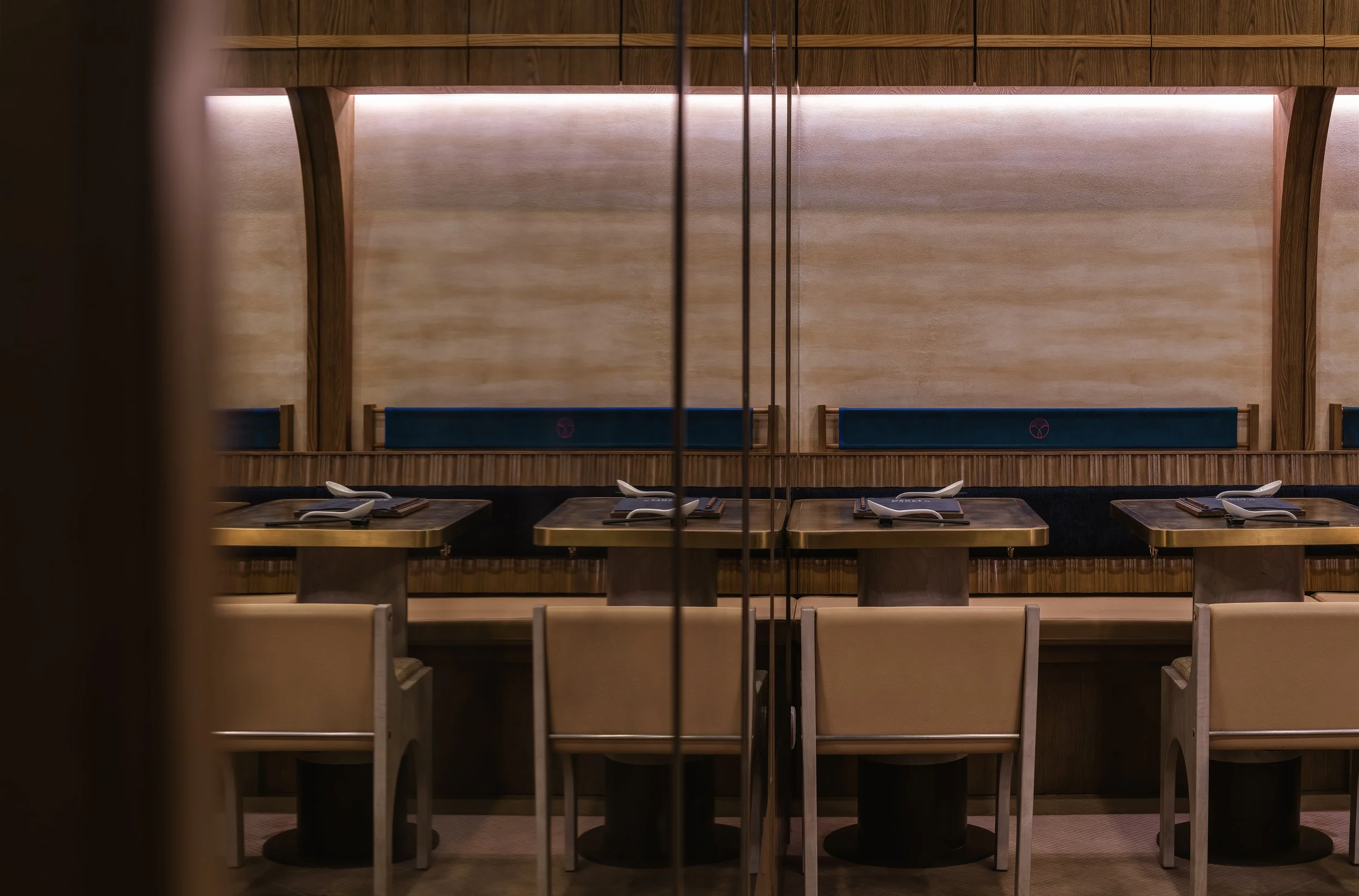
Beyond a branded Noren curtain, welcomes the general seating area. A triangular high table glazed with ceramic tiles and embellished coastal installations such as rocks and corals serves as a centrepiece. Encircling this space are customized shell-inspired leather benches, providing an intimate setting for group gatherings. The walls of the space were mounted with antique mirrors and textured paint to resemble the movements of ocean waves, creating a soothing and relaxing atmosphere.
The seating booths were meticulously crafted using wooden panels and upholstered in a midnight blue fabric with printed logo icons. Complementing this, the dining tables were constructed with antique bronze accents and tailored wooden legs, perfectly harmonizing with the overall color scheme and ambiance of the establishment.
Walking through a Ritualistic Journey
The rest of the store facade is coated with hand-plastered navy blue gradient texture paint, complemented by warm wood accents and architectural lines inspired by Fusuma structures. This creates a visually impactful exterior that celebrates the brand's cultural heritage. To further enhance the visual appeal, custom lighting treatments, such as backlit brass logo signage and wall-mounted Japanese lanterns, shell inspired lights, are integrated to infuse a bespoke touch. Reflecting the brand narrative, we integrated design elements found in the Ama's abodes, including wood, rattan, and tatami flooring throughout the overall store interior.
Embodying the essence of its name, the ramen bar area is reminiscent of traditional Japanese Menyas, which usually operate in an open setting, allowing customers to interact directly with the chefs as they prepare the dishes. The walls and arched ceiling of the space are adorned with wooden finishings and navy-textured paint, giving the illusion of being submerged underwater inside the Ama's timber buckets. To further infuse the space with Japanese ambiance, we incorporated Sangestu vinyl tiles to create a bespoke tatami-style flooring that covers the entire store space. All in all, these personalized details weave together an immersive dining experience for guests.
Moment
2023
Industry
Hospitality, Gastronomy
Credits
Collaterals Photography - House of Forme
Interior Photography - Steven Ko Photography
Services
Brand Management, Brand Identity, Collaterals Development, Packaging & Production, Art Direction, Interior Design, Brand Environments, FF&E


