Do Not Forget
Transforming Your Wellness Journey.
Do Not Forget is a locally found supplement brand who makes it their mission to shake things up in the industry. Dedicated to transforming the practice of supplement intake, Do Not Forget beautifies the process and casts aside any shadows of stigma. Their mission is profound yet simple: to shift the social narrative surrounding health supplements, turning daily intake into an empowering ritual that enriches both health and lifestyle. This brand invites everyone to create a new vision of wellness, celebrating taking charge of their health.
House of Forme worked with the client on their brand concept, visual identity, and branding collaterals.
See their website: do-notforget.com
Your Note To Self.
Maintaining health is as personal and intimate as our own thoughts. Inspired by the reflective practice of journaling, we created the brand concept "Note To Self". This concept mirrors the way we plan our days or casually doodle, turning personal health into a deliberate act of intention. Do Not Forget serves as a daily reminder to nurture our body and mind, empowering us to face life's various challenges with a resilient and healthy spirit. It is more than a mere call to wellness, it is an invitation to thoughtfully integrate health into your day-to-day life to lead a healthier existence.
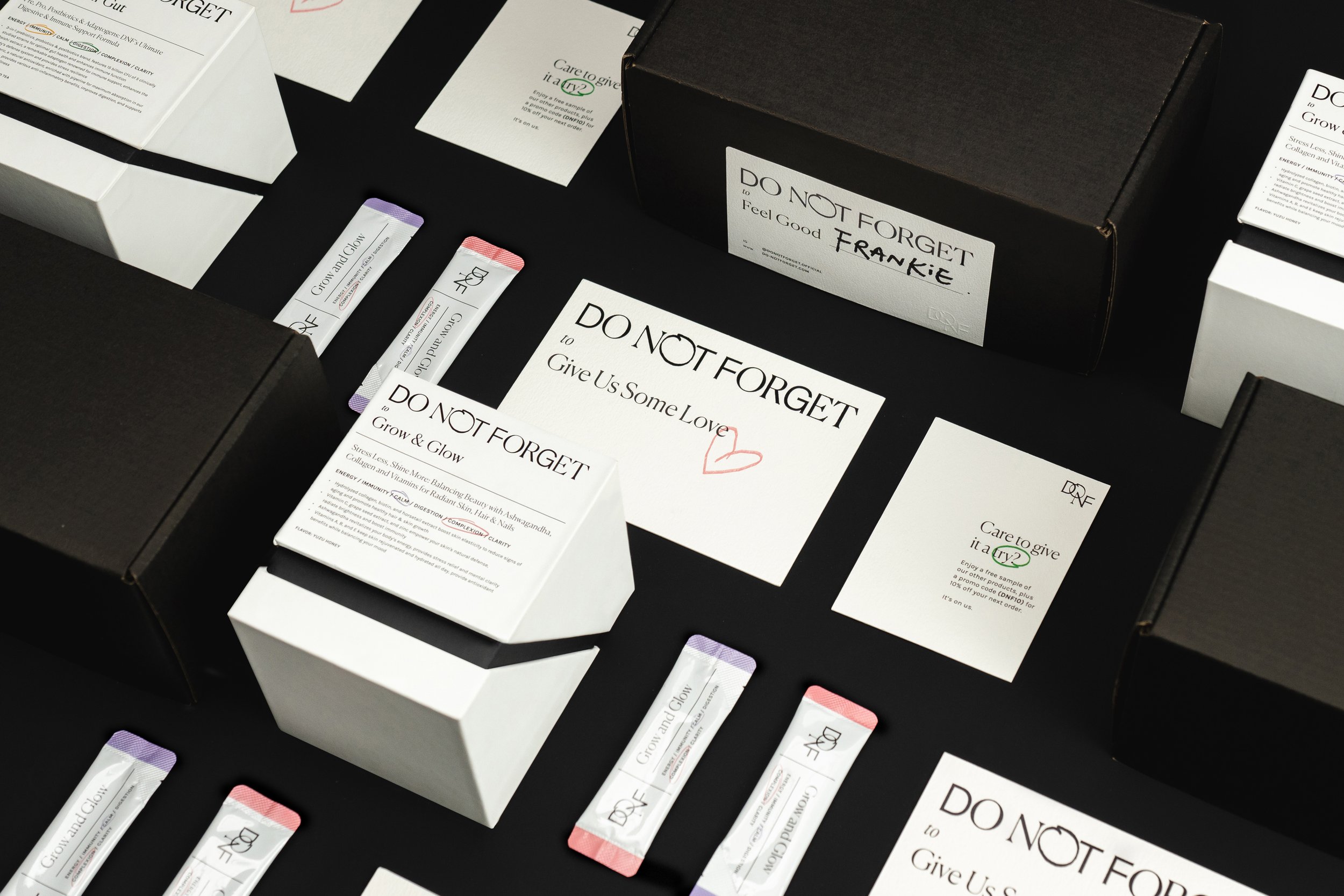
The art of journaling spans a wide spectrum - from the meticulous grids of bullet journaling to the care-free, whimsical layers of scrapbooking. Embracing this visual diversity, the brand identity for Do Not Forget strings together handcrafted typographic treatments and playful doodles, all punctuated with bold, punchy taglines. This approach lends the brand an edge and a vibrant boldness, one mindful note at a time.
A Whimsical Yet Timeless Identity.
Central to our identity is the master logo, crafted from a combination of serif and sans-serif typefaces, topped with a handwritten 'O' in 'NOT'. Our primary typeface is a clean and classic serif font that imparts a human touch to the brand. In contrast, we use a light sans-serif font for the body text. Together, these two typefaces blend timelessness with a contemporary feel, giving the brand a balanced and modern aesthetic. This typographic mix is also used to help reflect the diverse ingredients in the brand’s formulas, each element thoughtfully chosen for its unique contribution to creating a healthy impact. The handwritten ‘O’ adds a warm touch to the brand while it recalls the brand’s mission of reminding customers not to forget the importance of their health and wellbeing.
Do Not Forget is a duo-tone brand, with a primary colour palette rooted in the simplicity and clarity of black and white. This choice maintains the brand's clean and minimal aesthetic. However, to set the brand further apart from what’s existing in the crowded market, the brand’s palette is supported by six vibrant accent colours. Each colour, paired with its respective icon, serves as a guide to categorise different health goals including complexion, immunity, clarity, digestion, calmness, and energy. This colour-coded system not only enhances the brand's visual impact but also provides a flexible framework poised for future expansion.
Reinventing The World Of Supplements.
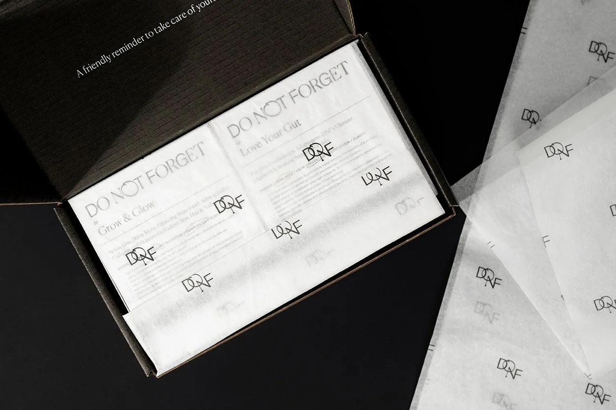
Throughout the brand's collaterals, there is an organic integration of rough doodles and handwritings, infusing a personal and artisanal touch to each element. The colour and iconography system is thoughtfully utilised to distinguish different products and their functions, ensuring clarity and ease of use for customers. These distinctive brand touches are seamlessly incorporated across all touch-points - from the packaging box and powder sachet to the wrapping paper, thank you card, e-commerce box, and e-commerce sticker. This comprehensive approach ensures a holistic and luxurious experience for all customers, topped with warm reminders like “Remember to feel good today”, it makes every interaction with the brand both memorable and meaningful.
In a world where supplements often feel perplexing, Do Not Forget is a breath of fresh air. This brand has effectively harnessed the power of simplicity and intuitive design, making it easy for consumers to navigate their health and wellness needs. Do Not Forget demystifies the supplement selection process, allowing individuals to focus on what truly matters - achieving their personal health goals, one reminder at a time.
Moment
2023
Industry
Retail, Lifestyle, Wellness
Services
Brand Management, Collateral Development
Credits
White Backdrop Photography- Do Not Forget


