TASS
A Mission for Systematic Change.
In the year of 2020, The Alliance for Sustainable Schools (TASS) was born—a collective of educational sanctuaries with a shared resolve to thread sustainability into the fabric of our future. To turn the brand into a beacon that would resonate internationally, we have developed a new brand concept and identity to encapsulate the very essence of TASS's ethos and ambition.
House of Forme worked with the client on their brand concept, visual identity, brand collaterals and website.
Shaping the Architect of Change.
TASS stands as an architect of change, an accreditor guiding its network—The Charter, toward the bright horizon of systemic innovation. With steadfast dedication, TASS champions the collective power of its schools, ignites youthful intellects, and collaborates with community pioneers to spark transformation in critical areas: from school buses, school buildings, to school food, and even school uniforms, offering enlightenment through their education for sustainability.
The "Better Together" concept we crafted for TASS is more than a motto; it's the embodiment of a commitment to collective action and shared strides toward a common goal. This design intertwines diverse shapes and figures, each representing the unique contributions of TASS's network, into a harmonious display of unity. It's a visual narrative that demonstrates how the synergy of individual efforts can amplify the impact of our collective potential.
Powerful Inspiration from Mother Nature.
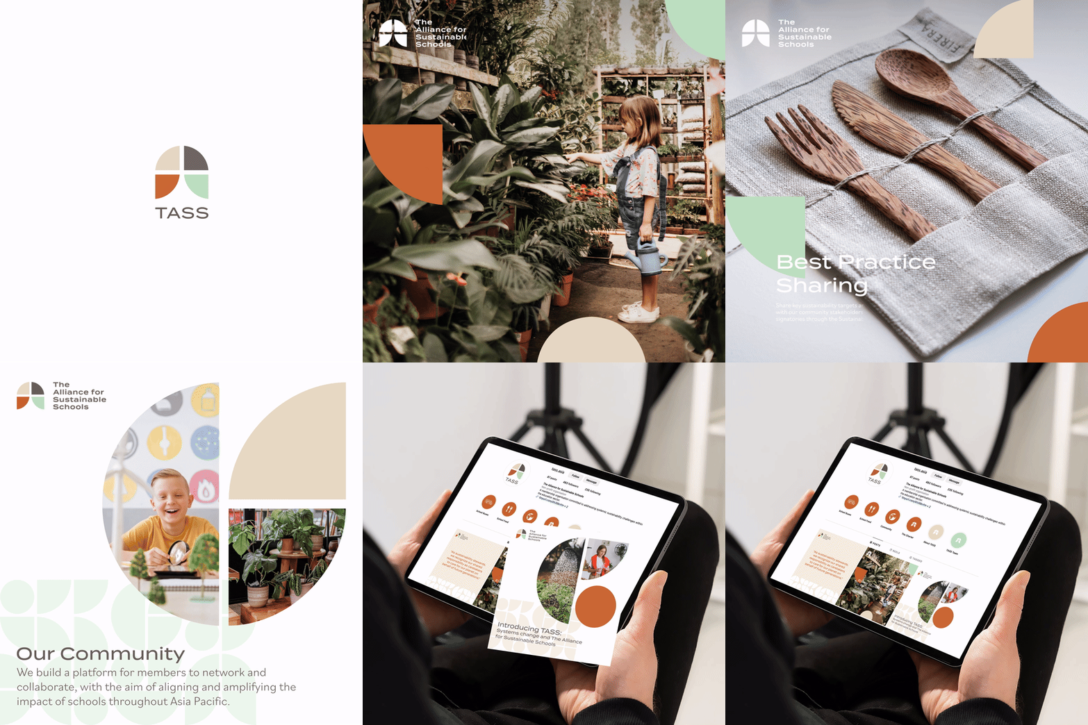
From the concept, we crafted an identity that whispers of the natural world, using the silhouettes of trees and leaves to subtly echo TASS’s dedication to sustainability. The TASS emblem, composed of four leaf-like forms, symbolises the spirit of community, while a central transparent 'T' that mirrors a tree, representing TASS as both a gathering point and a supporter of individual growth within a communal framework.
This emblem is imbued with hues of nature, with a palette ranging from the rich depth of Earth Brown and the soft neutrality of Sand Beige; to the vibrant vitality of Leaf Green and the warm glow of Sunset Orange, all reflecting the brand's unwavering commitment to sustainability.This versatile emblem transitions across various materials and digital spaces, testament to a brand system that achieves clarity through simplicity and purpose.
Crafting Cohesion in the TASS brand.
To ensure a consistent and cohesive brand presence for TASS, both online and offline, we developed a straightforward yet effective set of brand collaterals. These materials work in unison to solidify their identity and showcase their professional approach. A strong business card serves as the foundation for any corporate relationship, and TASS's business card is designed to be memorable. Incorporating the brand's secondary graphics, we added a die-cut feature to the logo, lending a professional look with a subtle hint of energy.
This concept of professional, yet dynamic design is carried through the entire range of TASS's branding materials. Invitation cards and their corresponding envelopes, speaker lanyards, and even digital elements like the website and infographics all maintain the brand's visual language. Each piece is crafted to be both aesthetically pleasing and reflective of TASS's mission, ensuring that every touchpoint with the brand reinforces their identity and professionalism.
Moment
2021
Industry
Corporate, Education
Services
Brand Management, Collateral Development, Content Creation, Website Design & Development


