The Chapter by HKJC

Celebrating Your Life Journey With HKJC.
Established in 1884, The Hong Kong Jockey Club stands as one of Hong Kong's most venerable organisations. It is renowned not only as an horse-racing club but also as a distinguished non-profit organisation and exclusive social membership club. In order to encourage members to commemorate their next big chapter with HKJC, we have developed a new brand collection name and identity, encapsulating the opulence, contemporary essence, and distinctive features of the four Hong Kong Clubhouses.
House of Forme worked with the client on their brand naming, concept, visual identity and branding collaterals.

Crafting Timeless Moments Of The Heart.
The 4 Clubhouses under The Hong Kong Jockey Club’s wings are all unique in their own way ranging from more prestigious to more contemporary. One can stroll through the lush greenery at Beas River Country Club, or have a happy hour drink at The Hilltop In The Valley, with its state-of-the-art, modern architecture. All 4 Clubhouses are privately owned, ensuring members can create indelible moments with loved ones. To gather the 4 venues under a harmonious brand identity, we envisioned “The Chapter by HKJC”. The name was created to be distinctive and timeless, reflecting the prestige of HKJC but also convey the brand’s purpose to inspire their members for their next celebratory event.
The concept “A Collage of Memories” is woven together with the nostalgic threads of past memorabilia – the sepia-toned narratives of old photo albums, the personal touch of handwritten letters, the travelled charm of postcards, and the curated collections within journals and scrapbooks. We view each venue as a journal waiting to be penned, an invitation for members to write on the blank pages with their experiences, creating their very own HKJC chapter. Every venue is a portal to a world of limitless possibilities, a place where members are gathered to begin their next chapter in life with the Club.


Crafting Warmth With Sophistication.
Our logotype draws its essence from the humanistic nature of handwritten correspondence, such as letters, postcards, and notes. Delicately weaving brush strokes into the typography, infusing an added sense of warmth and the tactility of the human hand. We have also artfully embraced curves that echo the fluidity of signatures and the elegance of traditional penmanship, exemplified by the extended stroke on the 'T' that evokes the flourish of a signed name. This design choice is a nod to the bespoke craftsmanship of personal expression, lending our logotype an air of sophistication and authenticity.
Our logomark is a contemporary reinterpretation of the classic postmark, designed with minimalism in mind. Seamlessly incorporating the initials ‘HKJC’ into the icon to symbolise the Hong Kong Jockey Club's heritage and authority. This iconic emblem serves as a distinctive mark of the Club's brand identity, consolidating the cohesiveness of the overarching brand.


Designing Your Forever Journey.
In an effort to revamp the leasing team's marketing materials, we meticulously assembled a collection of sales kits that include brochures, factsheets, letterheads, and postcards tailored for a variety of events, ranging from corporate functions and weddings to family and social gatherings. Throughout these collaterals, a hand lettering element is accompanied by imagery, reflecting the illusive spontaneity of postcards, diaries and scrapbooks.
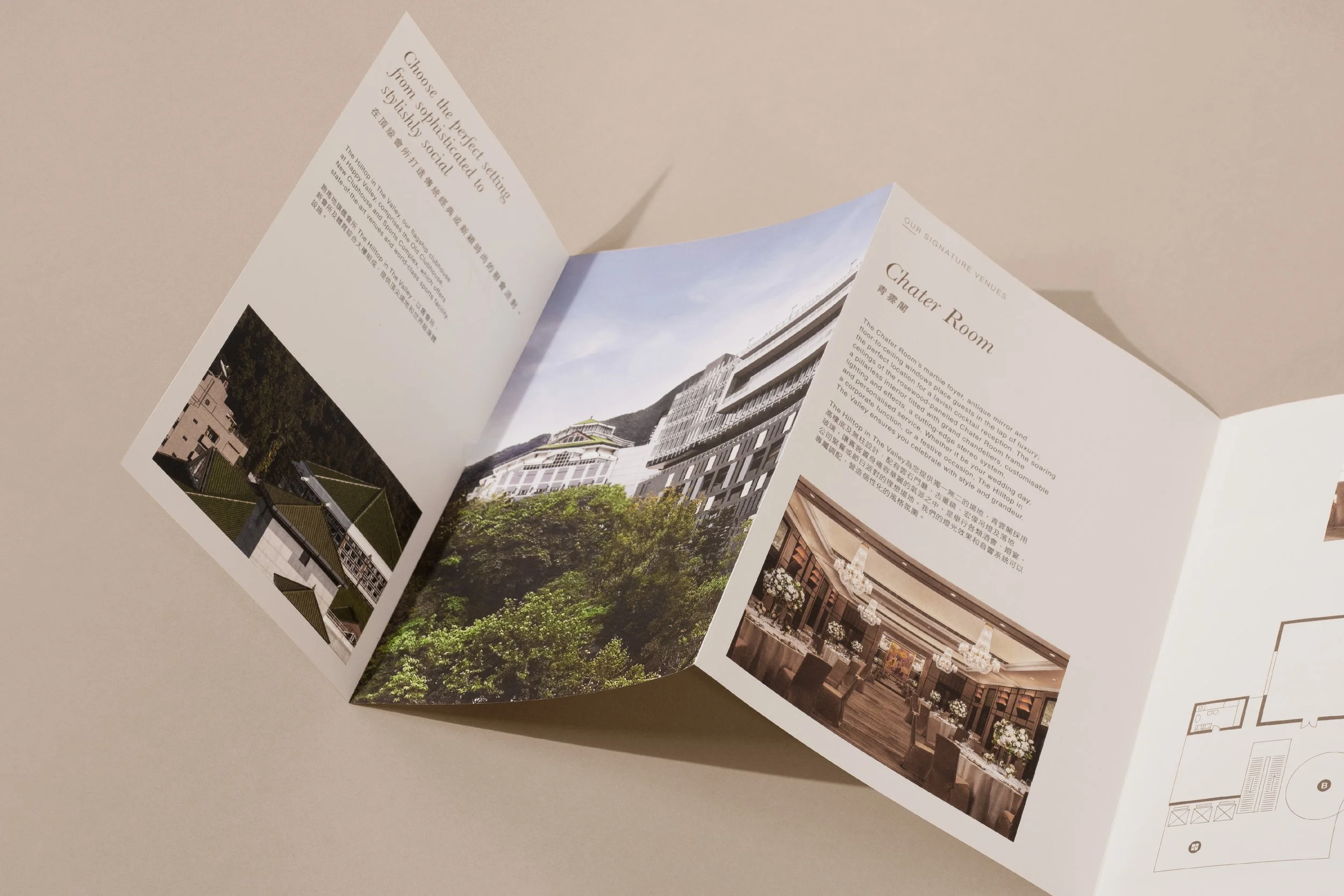
The brochure design draws its inspiration from the intimate, personal feel of photo albums. To transform these brochures into a suite of elegant publications that not only speak of quality but also resonate warmth and reminiscence, a side-sewn binding was introduced. This traditional technique is complemented by the sophistication of gold foil stamping on the cover flap, which adds a touch of luxury. Similarly, we have employed a metallic finish on the headlines, headers, and page numbers. The Jockey Code and colours from the master brand has also been applied to The Chapter’s brochures, further extending the overarching identity of Hong Kong Jockey Club.


Creating The Most Unique Experience For You.
Concise factsheets for individual venues provide essential details including capacity, floor plans, and venue highlights, all presented on FSC-certified paper with metallic Pantone accents for a touch of understated opulence.
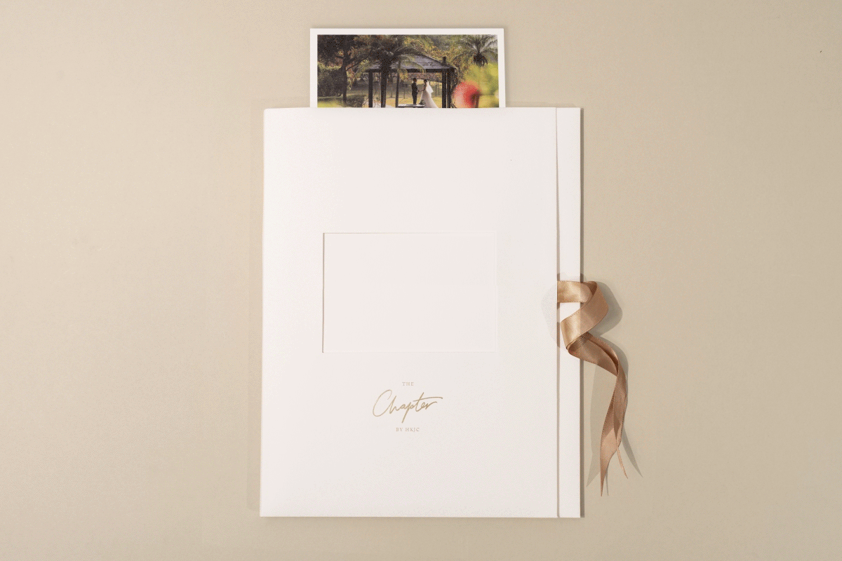
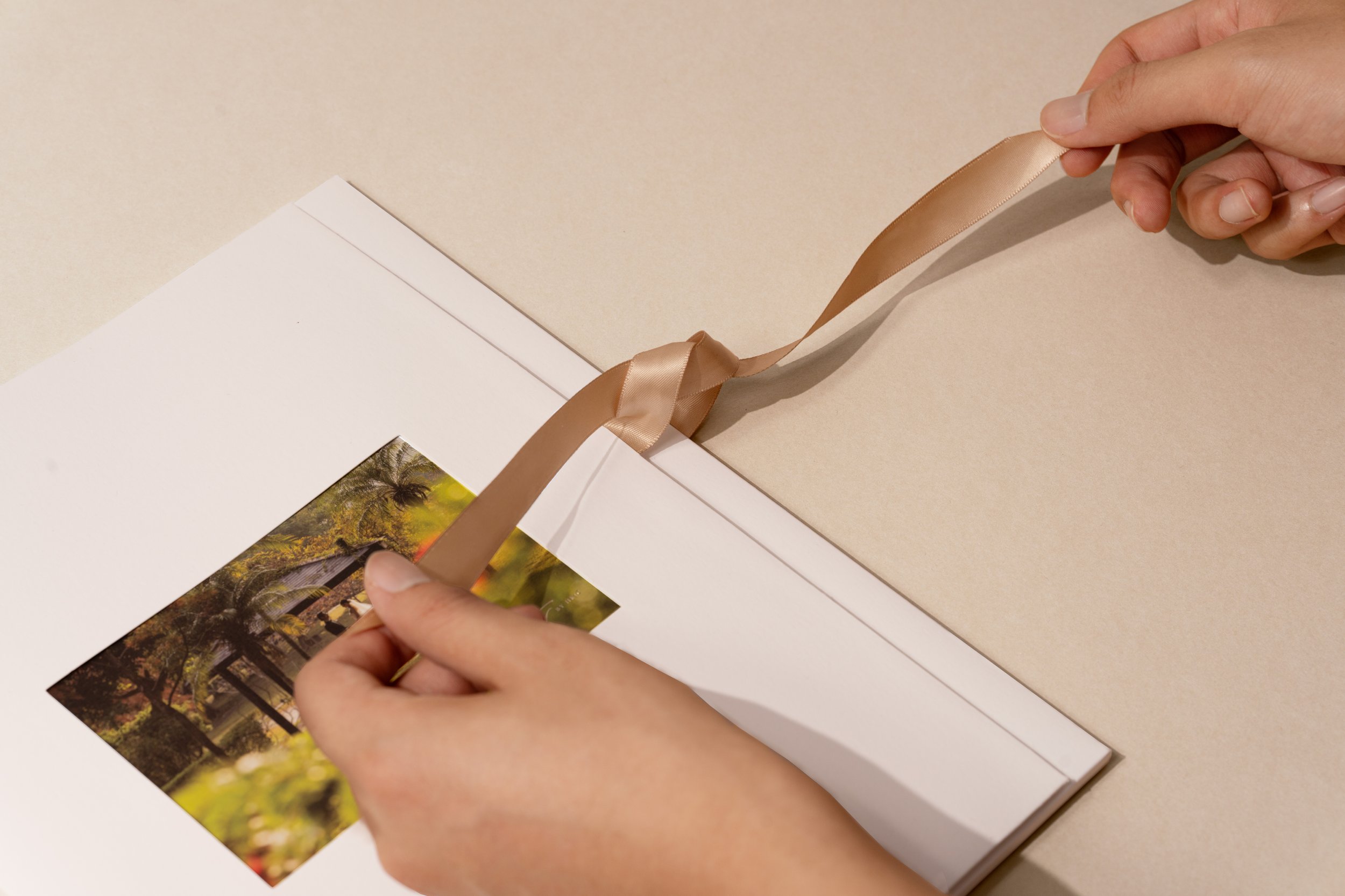
For the leasing team’s convenience, a presentation folder consolidates all necessary materials. a set of bespoke postcards for different occasions are included for the Club’s team to add a personalised message after meeting with the client to elevate client engagement. The ribbon closure of the folder is a deliberate touch, transforming each presentation into a gift-like experience, offering both personalisation and the delight of unwrapping a present.


Moment
2023
Industry
Hospitality, Corporate
