CLEAN COFFEE TST
World's First Tap & Go Specialty Coffee Bar
With a commitment to making sustainable living more affordable and accessible, House of Forme’s design for CLEAN’s tap & go speciality coffee bar offers both quality and efficiency, designed for the fast-paced environment of Hong Kong.
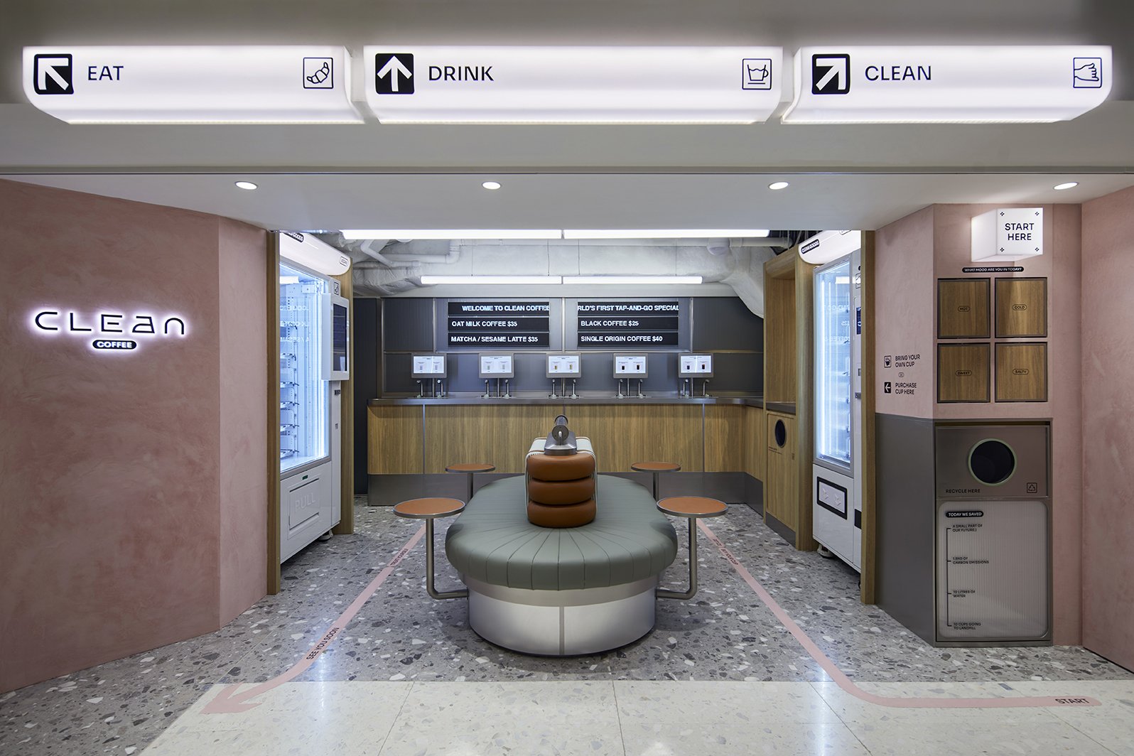
Located inside the iconic basement of Chung King Mansion, the design concept pays homage to its unique location. Just like an arrival hall, CLEAN is a buzzing transit stop full of movement and energy, a portal that transports you to the future of coffee and sustainability on-the-go.
House of Forme worked with CLEAN on their brand concept, identity design, brand environments and interior design.
See their website: www.youareclean.com


The Arrival Hall of the Future.
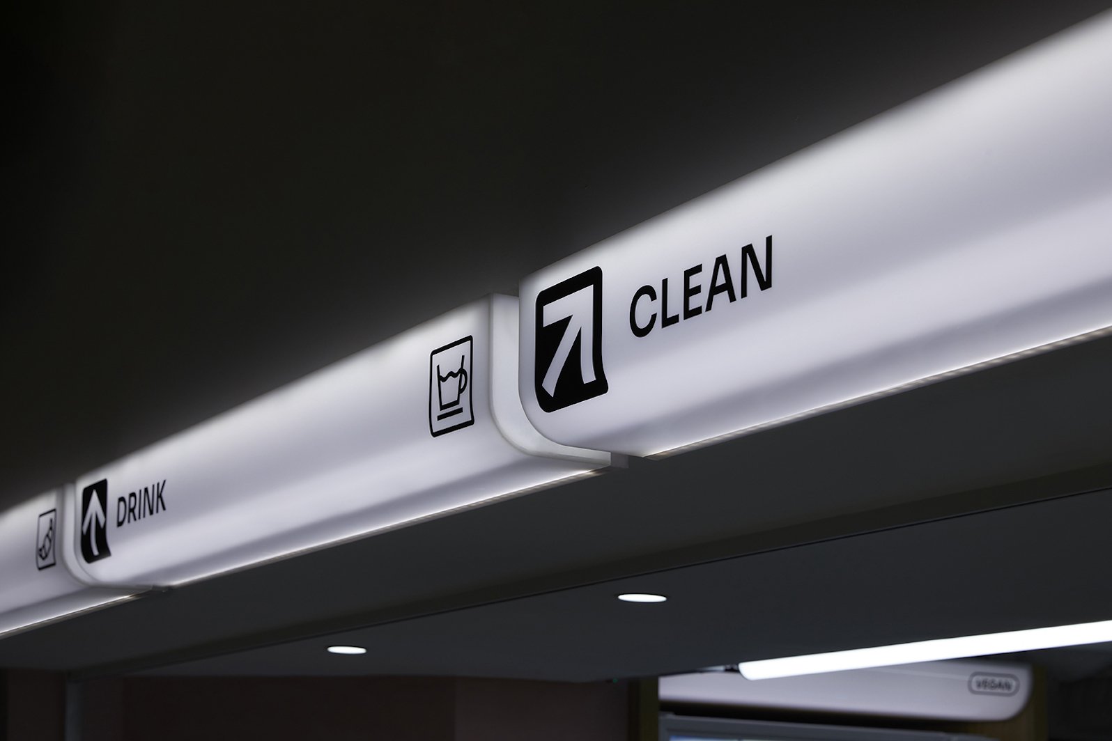
Drawing inspiration from airport departure/arrival halls, CLEAN's unconventional personality can be experienced at every touch point. Creative reinterpretations such as LED menu signs, luggage belt inspired banquettes, grey terrazzo floors, and stainless steel joineries, all contribute to an atmosphere that is sure to inspire and delight.
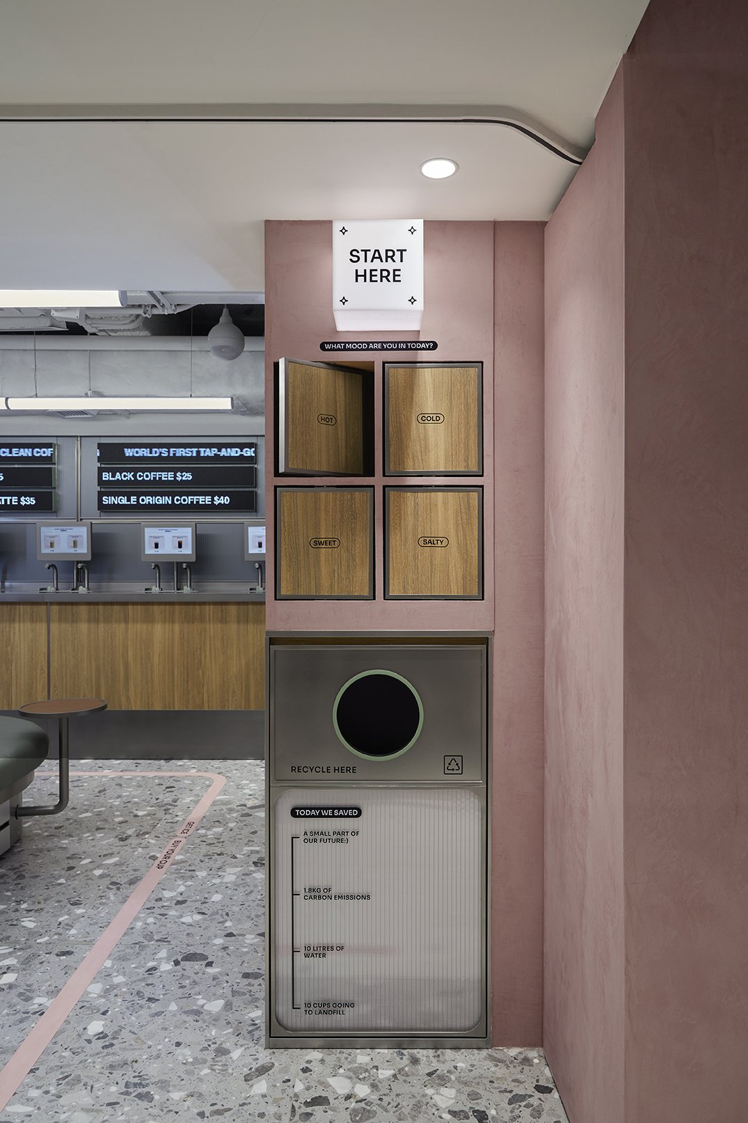
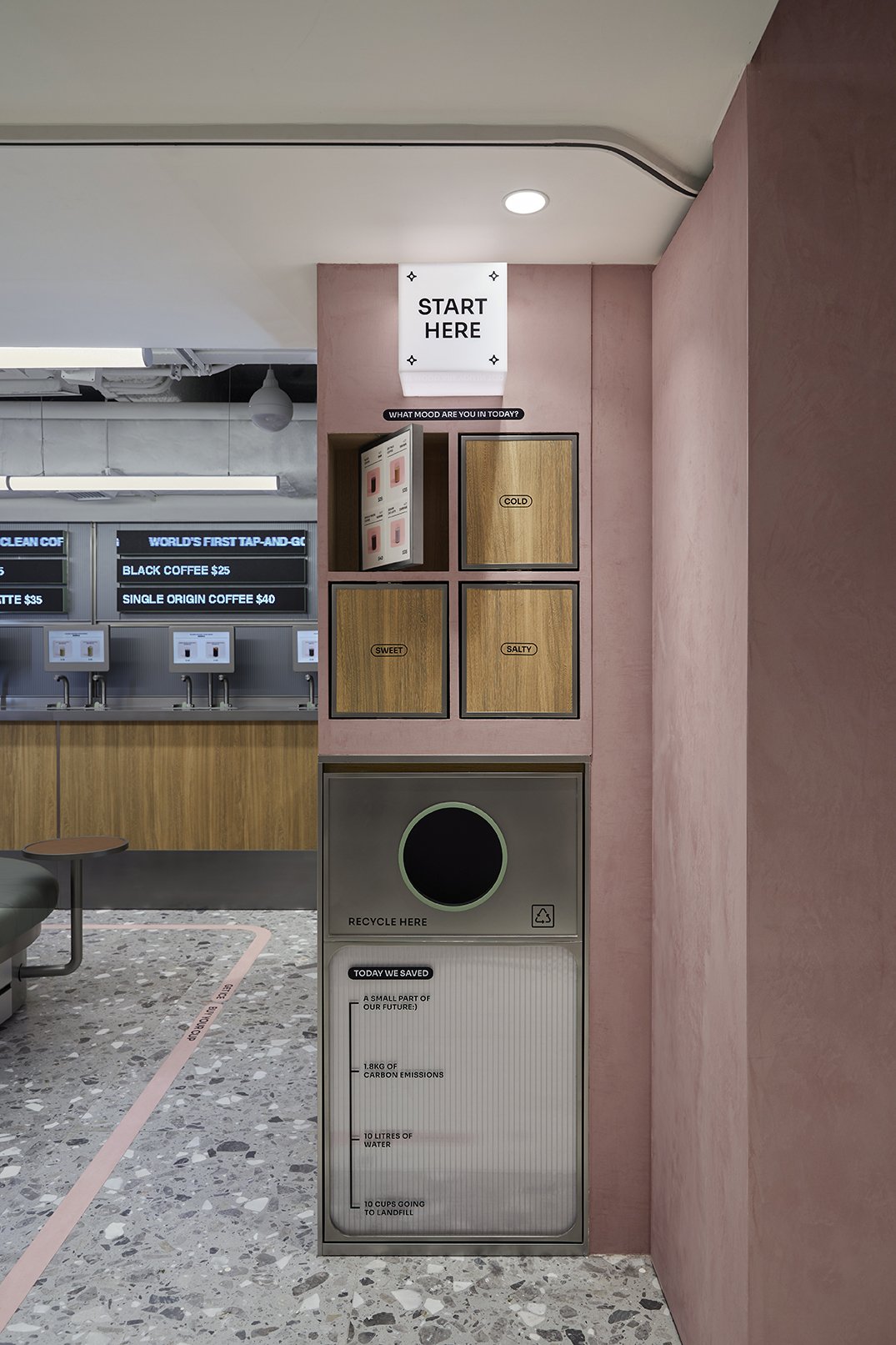
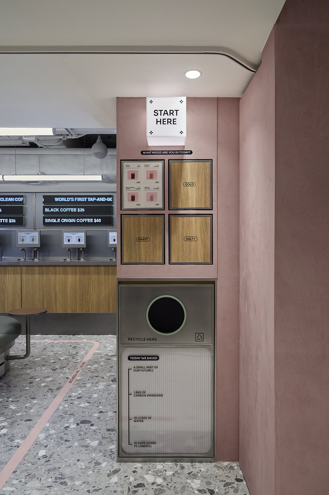
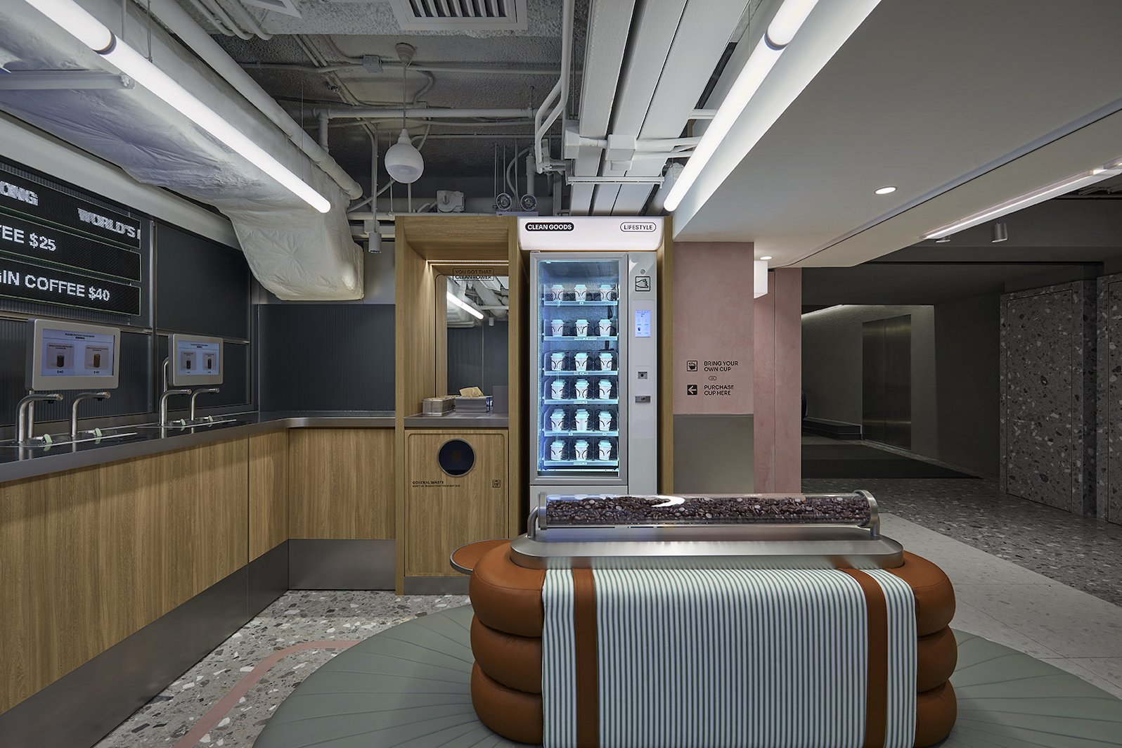
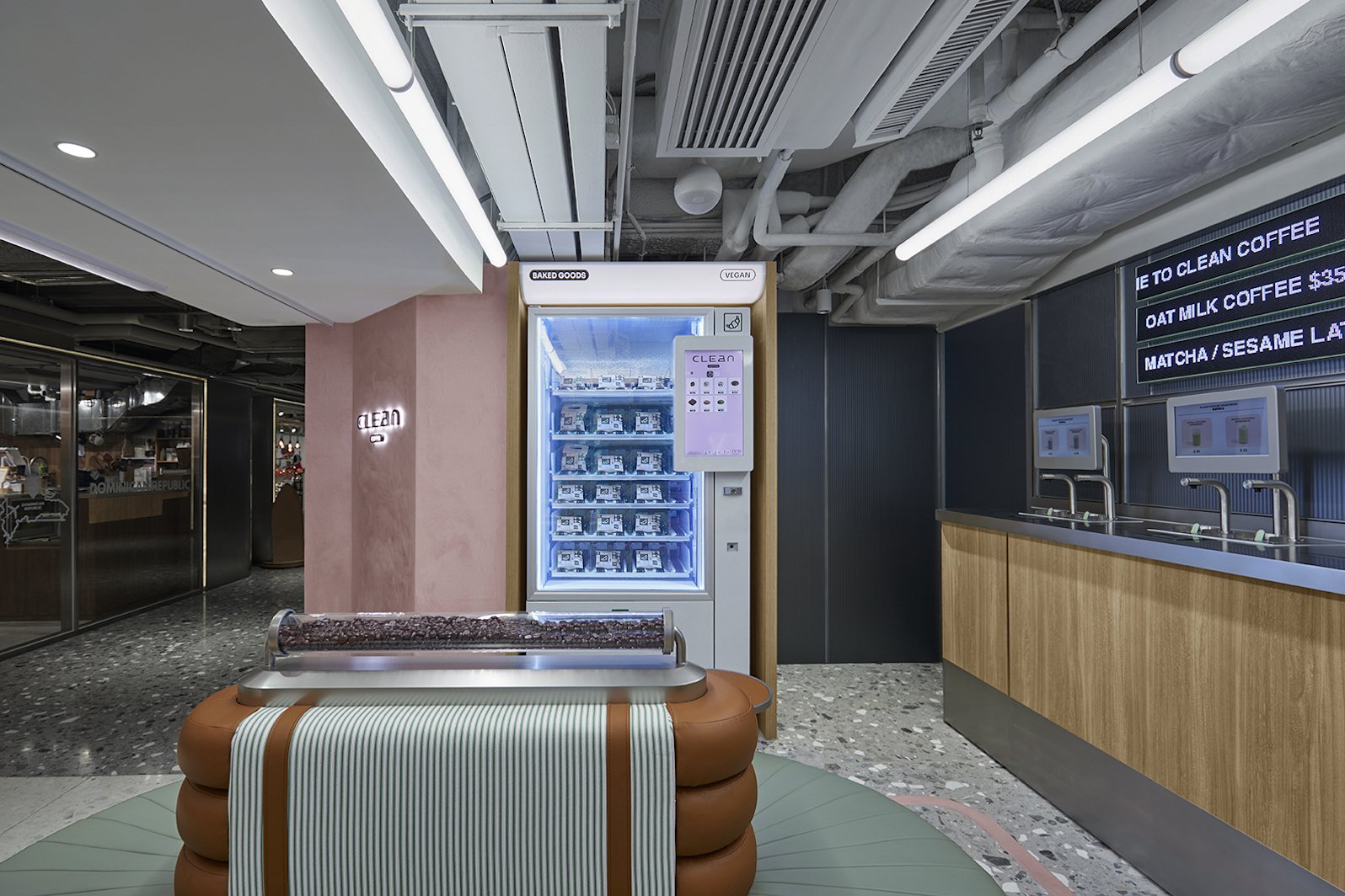
Upon arrival, guests are greeted with CLEAN’s signature pink facade in plaster paint finish, with three directional light boxes guiding users to their desired zones. From ‘CLEAN’ which includes the brand’s own merchandises, self-serve station and recycle bins, to ‘DRINK’ which includes their proprietary taps for specialty coffee, and to ‘EAT’ where customers can purchase CLEAN’s freshly made cookies and pastries.


Spatial Planning & Experience.
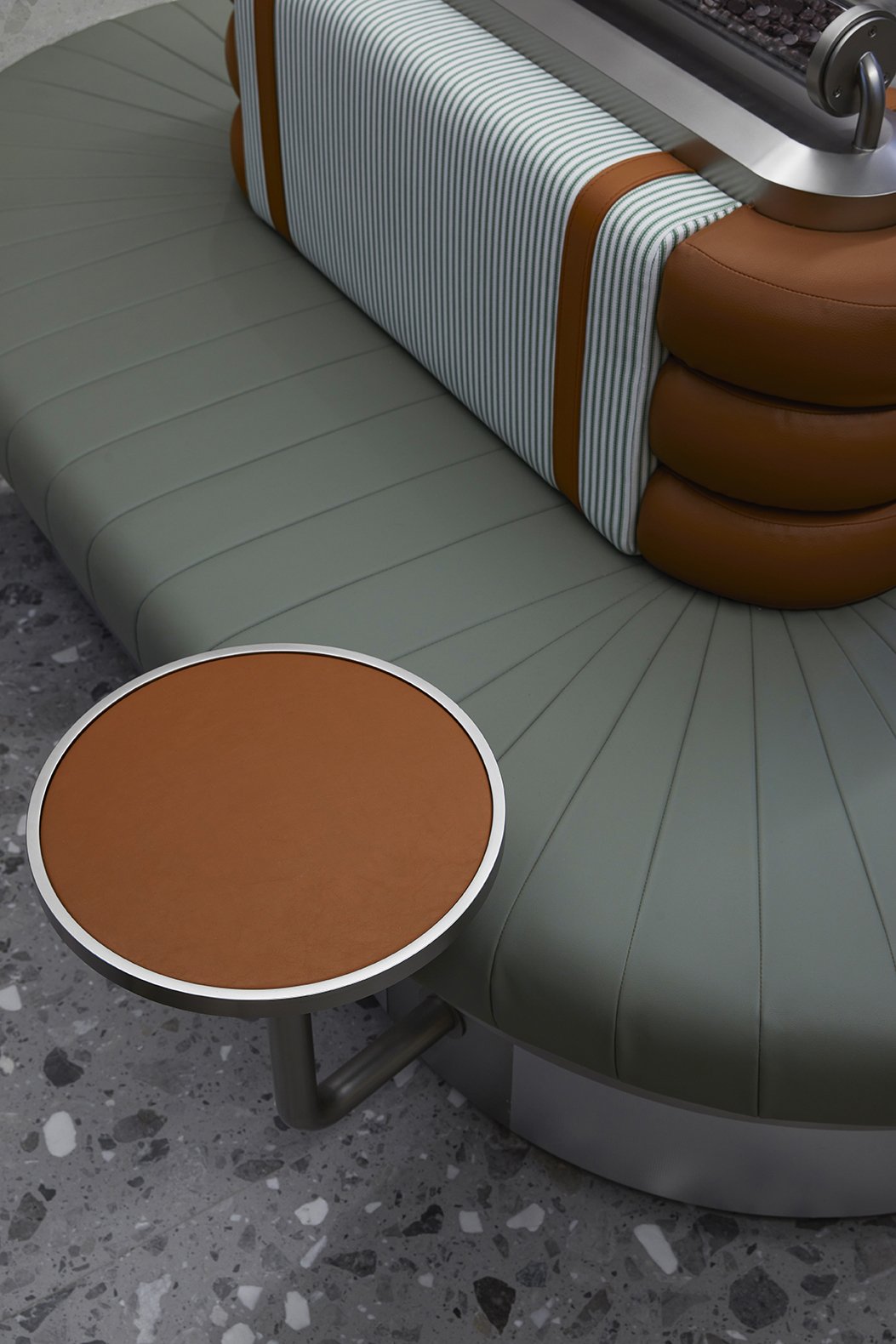
A bespoke green oval banquette sits at the centre of the shop, encouraging social interaction and for guests to kick back and relax after their purchase. Its design was inspired by luggage belts and suitcases in airports, visualised through pin striped fabric, brown leather details and green PU vinyl in repetitive stitching.
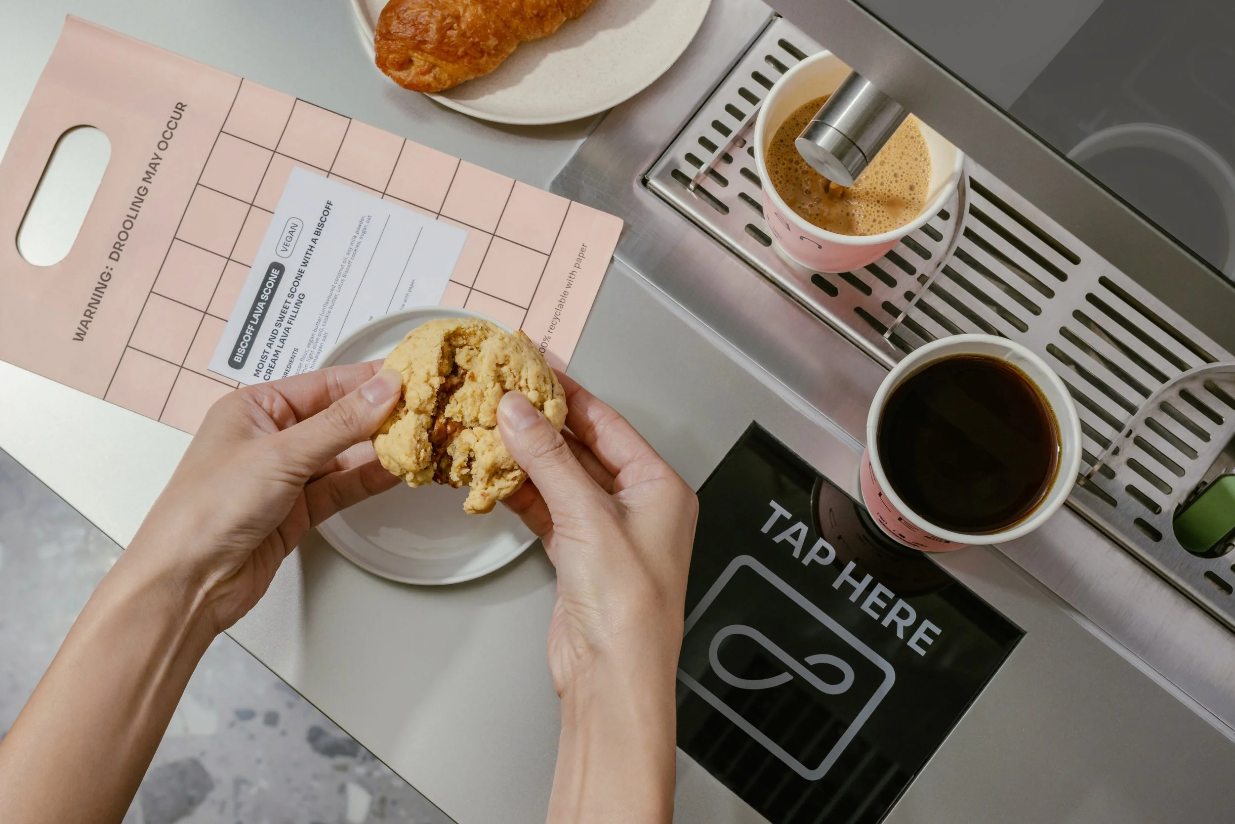
Gleaming vending machines are strategically placed on either side of the open shop, showcasing rows of freshly made bakery goods and pastel pink paper coffee cups. In the middle of the space, a row of brushed stainless steel taps line the wall, with touch screens positioned above them that display images of CLEAN’s specialty drinks in both cold and hot versions.


Customised Environments With Strong Brand Personality.
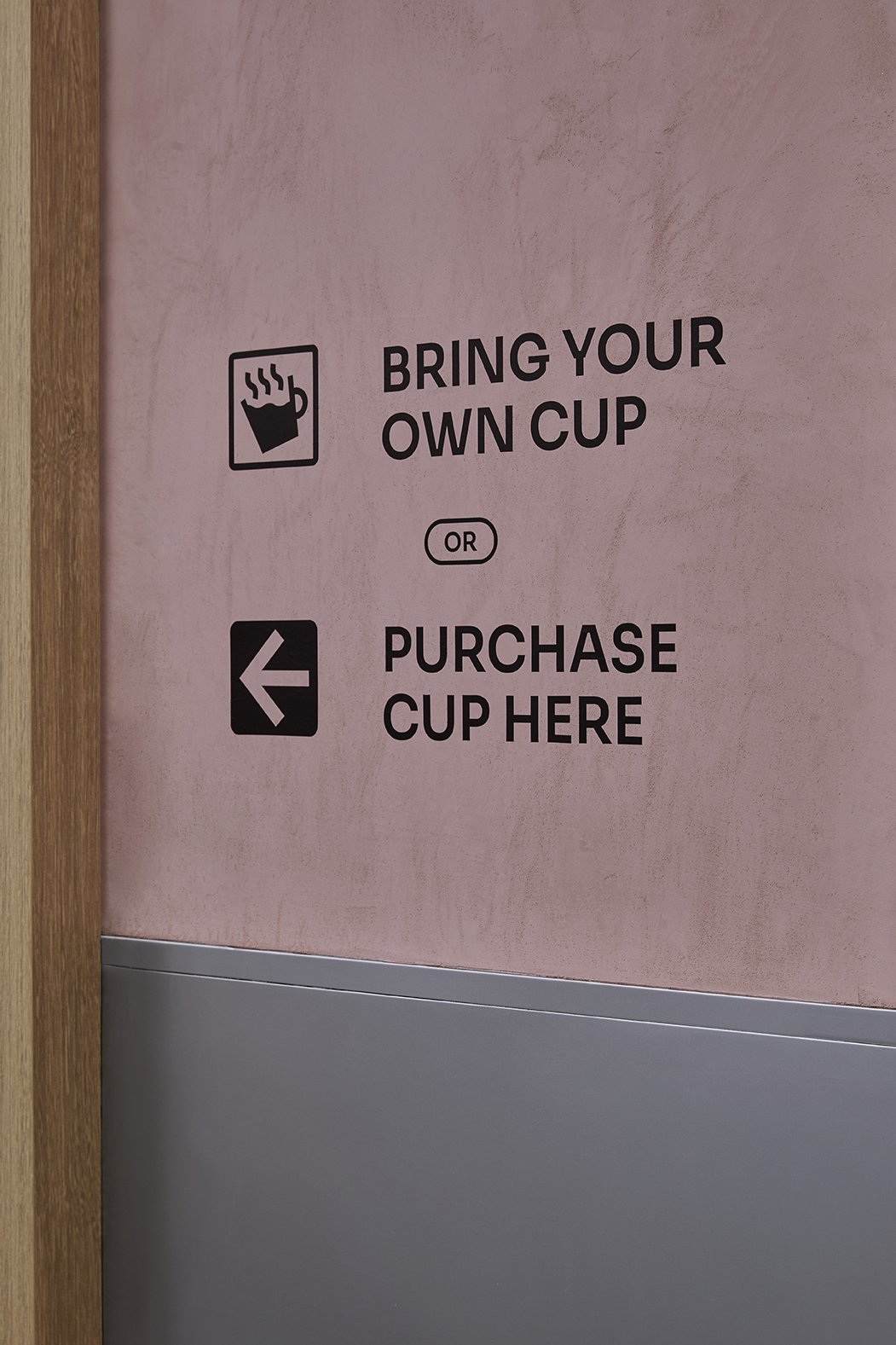
To ensure an efficient ordering process and seamless user experience. Signages are placed strategically across the different zones to guide customers through the ordering and pick-up process. A pink way finding sign on the floor serves as a visual cue, effortlessly leading customers to order, pay, and enjoy their beverages and snacks.
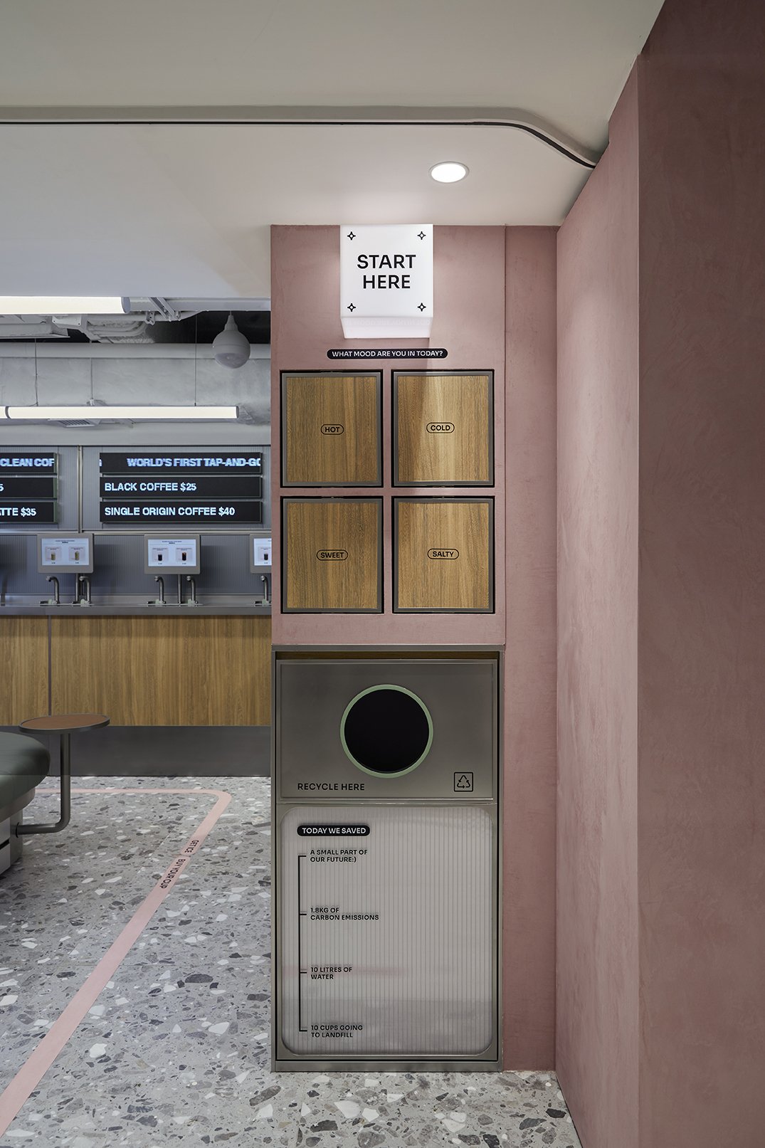
Other signages include interactive menu categorised by mood, various light boxes and instructional vinyls, all injected with playful messages and puns such as "you got that clean power" and "what mood are you in today" to reflect CLEAN’s unconventional personality.


Sustainability In The Details.
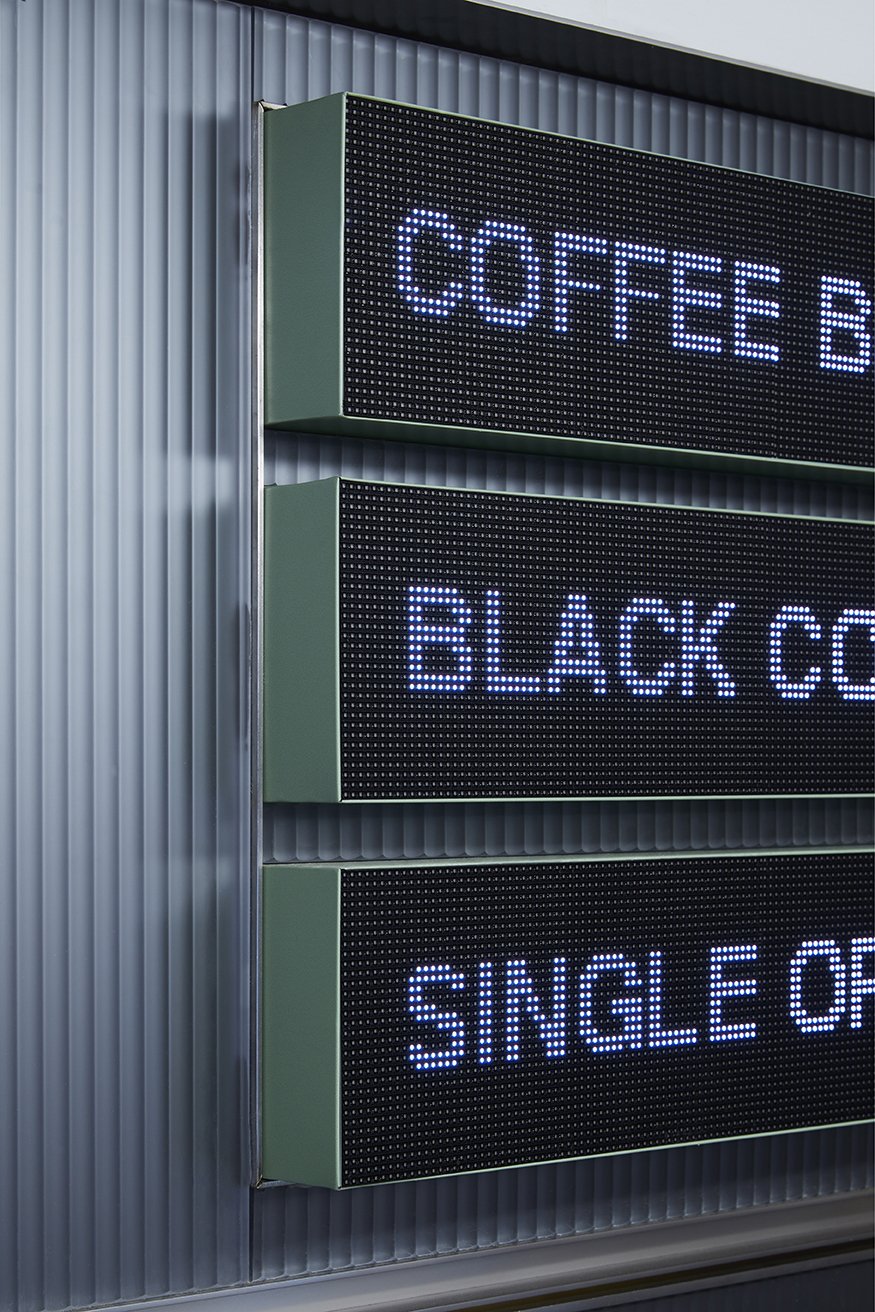
Fluted glass and mirrors were incorporated at the back of the shop to create an optical illusion of infinite reflections. This element not only adds depth and dimension to the space but also visually connects the interior to the lively streetscape outside. Overlayed with bespoke custom LED menus that is easily modifiable and cost-effective to update. The system can be remotely updated through a phone app, enabling CLEAN to swiftly rotate items and adjust their menu offerings as needed. Furthermore, the LED display menus automatically rotates the words and items, making the menu easier for customers to read and navigate. A more sustainable solution to traditional menu boards.

Moment
2023
Industry
Cafe, Retail, F&B
Services
Brand Identity, Collaterals Development, Art Direction, Interior Design, Brand Environments, FF&E
Credits
Food Photography- Sixteen photo
Interior Photography - Alex Tam Studio
